
As the lead designer, I defined the vision, information architecture, and UI direction for the Risk Visualizer. I worked closely with PMs, dealers, engineering, and analytics to translate risk concepts into intuitive layouts, and shape how the MVP would be measured post-launch.
Designing in the FX risk domain required simplifying highly technical concepts without losing nuance. Much of the data consumed by the Risk Visualizer came from internal systems never intended for client visibility, so part of the work involved transforming raw internal logic into human-readable interfaces. The MVP moved quickly, with three modules designed in parallel under tight timelines.
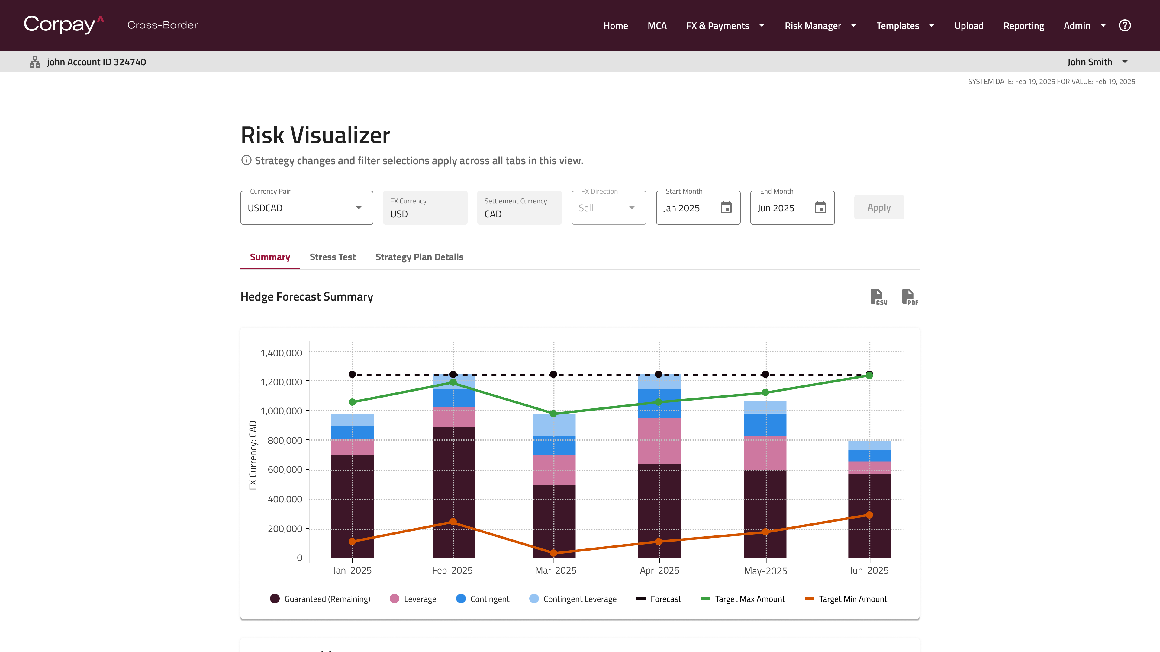
The Summary page became the primary entry point for understanding a client's FX stance. I designed it to highlight net exposure as the dominant mental model, supported by a modular structure of charts and toggles. The page allowed users to view their hedge strategy without losing context, while providing clear signals for currency direction and risk. My goal was to present complex exposure data in a way that felt structured, readable, and immediately actionable.
The Strategy Plan Details page allowed clients to edit their cashflows, an essential but often confusing task as a common method was transferring spreadsheet data to digital. I created a modular table system with clean, isolated editing flows so users could adjust dates, amounts, or currencies with confidence. The design empowered clients to manage their own forecasts without heavy dealer involvement.

Stress Test was built to let clients explore "what if" scenarios by applying different hedge amounts, rates, or market shifts. Scenarios tested would update in real-time, reflected in the respective forecast chart. This made experimentation feel lightweight and safe, while still offering meaningful insight into how risk would change under different assumptions. The design emphasized clarity, comparison, and reversibility.

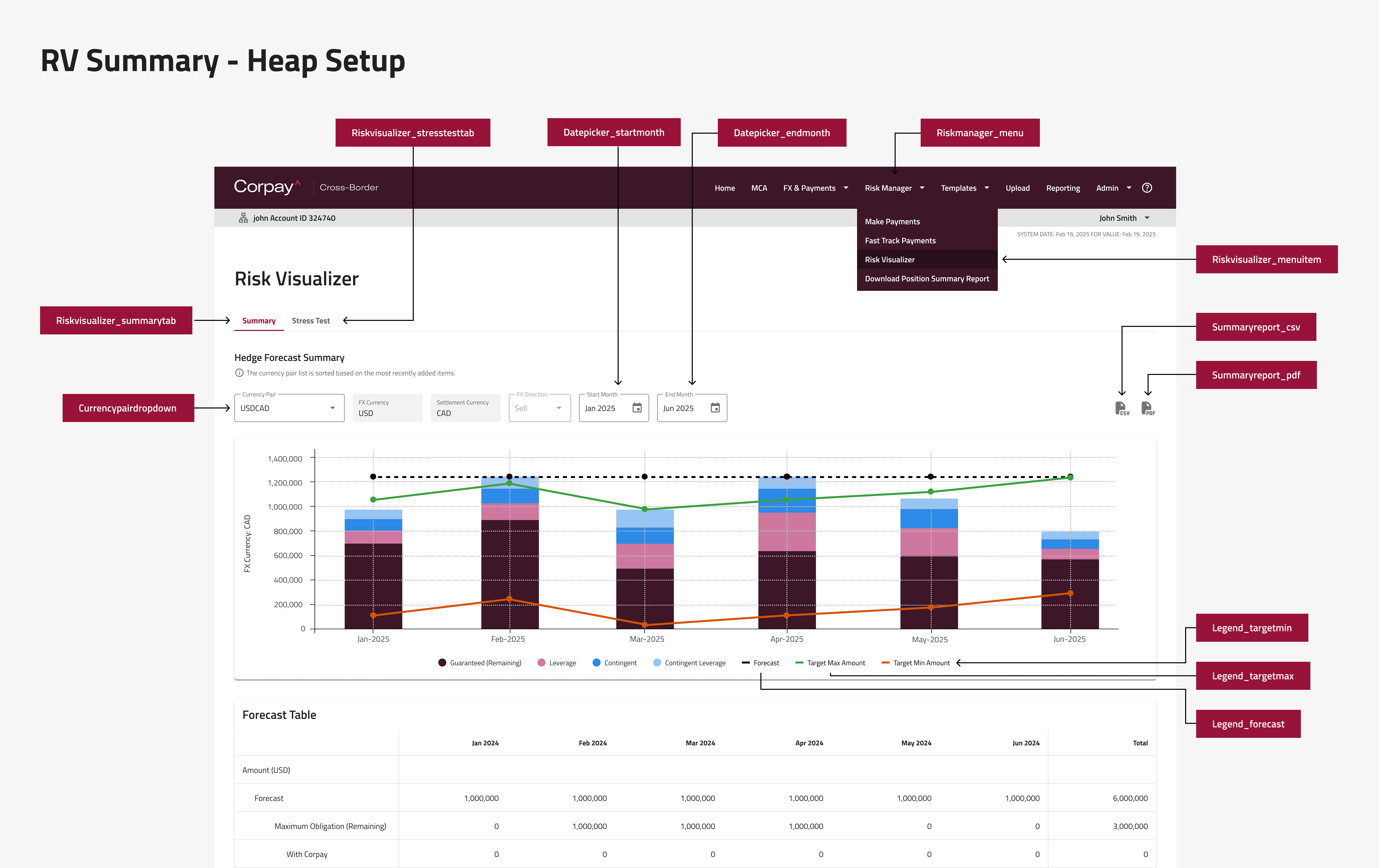
To ensure the MVP could be evaluated properly, I created a full tracking schema for the Summary page and supporting interactions across the product. This included tracking view toggles, scenario creation, table interactions, null states, and export behaviours. The schema established a clear foundation for understanding client adoption, learning curves, and opportunities for future enhancement.
In preparation for launch, I had planned a research framework and created a comprehensive Miro board to guide interviews with ten early-access clients. This included research goals, interview scripts, hypotheses, data flow diagrams, and synthesis structures. The interviews focused on first impressions, comprehension of risk concepts, clarity of visualizations, and the usefulness of editing and testing tools. The structure ensured we could quickly identify the areas clients found most valuable and where further iteration was needed.
If you like what you see and want to work together, shoot a message to the email below.
ptr.khp@gmail.com