
.png)
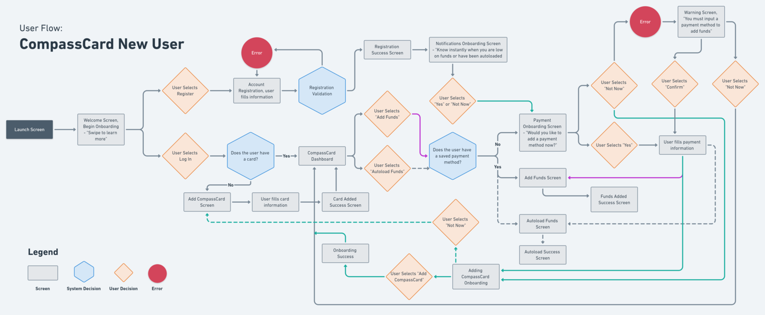
After conducting user research and speaking with users who commute on a daily basis, I discovered one common user behaviour. Many commuters confirm using their transit app for two main reasons: loading funds, and viewing card activity. Learning these use cases, I built high-level user flow charts to help frame my app design.
To design a mobile app for Compass Card users that combines the aforementioned use cases and to ultimately improve a user’s commute by simplifying their transit card management.
My goals were to create an app that will help commuters:
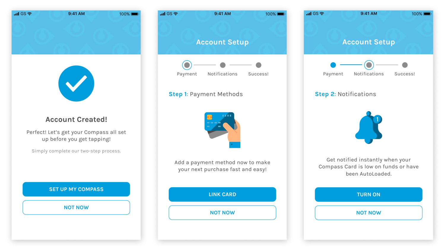
User onboarding serves as an integral part in Compass Card’s app design. As the concept implies, user onboarding is a fundamental process that eases the user into using an app on a comfortable level. And for some, it is to educate them on their first use, explaining features that are readily available to them. Narrowing my focus towards user onboarding allows me to remove redundancies that can improve the overall experience of a user’s commute. For example, by suggesting the action of adding a payment method early on, users can benefit from the convenience of a ready-to-pay app.
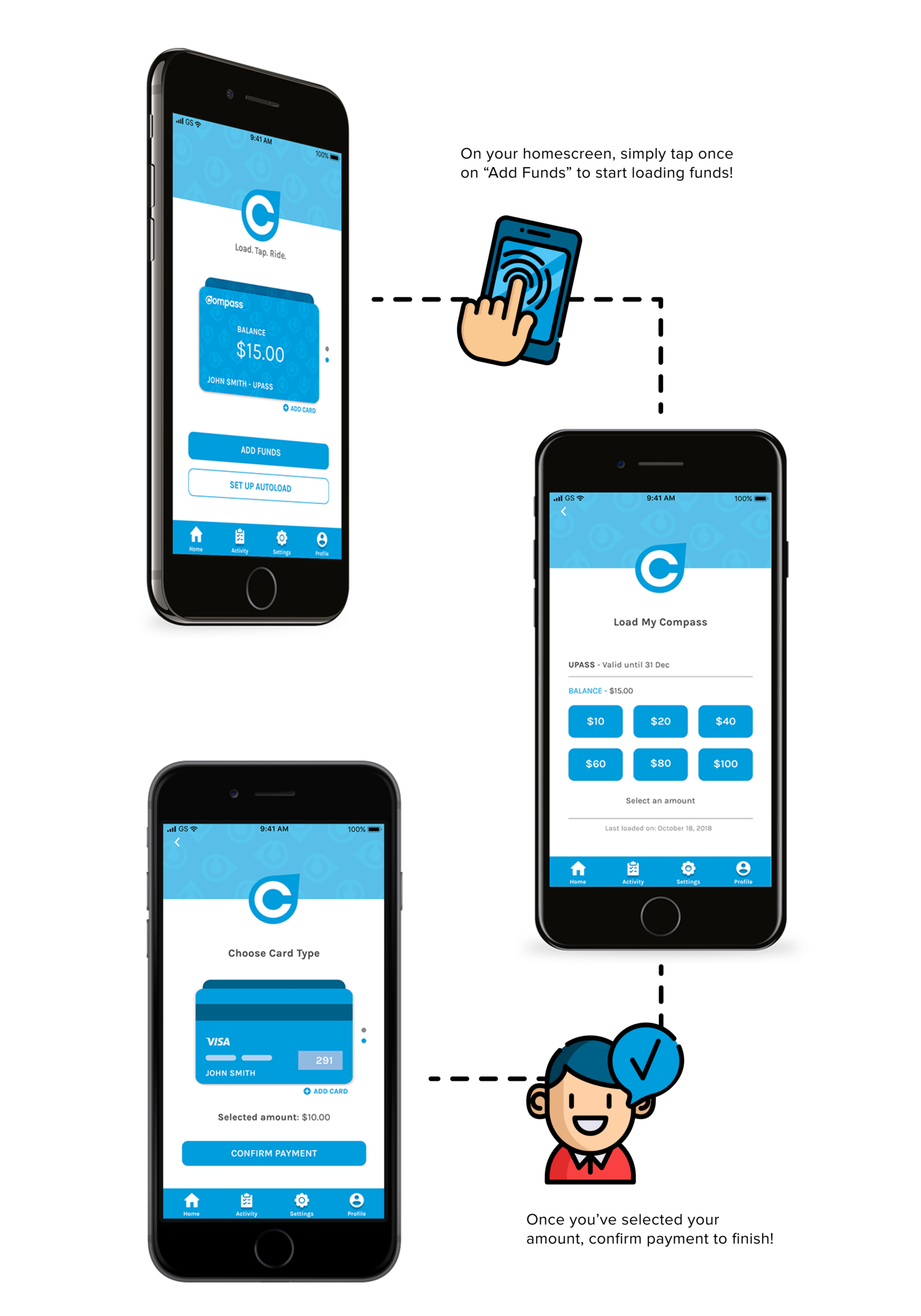
Designing for efficiency, Compass Card’s homescreen enables users to benefit from a simple “3-tap" process to easily load funds onto their transit card. By reducing the amount of taps, the time required for users to accomplish their objective is also minimized. Users no longer have to open their web browser, navigate, and sign in just to manually complete one simple task.
If you like what you see and want to work together, shoot a message to the email below.
ptr.khp@gmail.com